
I had to embrace my art movement which is Bauhaus when creating my first mark making sheet. At this point I slightly different inspiration for my print design I was still interested in colour but I preferred more pastel colours. I also looked into the Bauhaus alphabet as I thought this could work really well on a print design. I was also inspired by war and the weapons used when at war as Bauhaus came around after WW1. This is why I chose to create a gun which was made out of lipsticks as this is a weapon but it has been made up out of more interesting materials and lipsticks are feminine which is something I knew I wanted to portray in my garment. I chose mac lipsticks mainly as I think they have a very interesting shape as well as resembling bullets.
The block colours 'samples' on the page were inspired by the the use of colour within Bauhaus which is a key factor within this art movement. I thought about this more deeply and when thinking about paint I thought of the samples that you can get from Dulex which is what give me this idea. I also played around with blowing ink as I think this looks really effective and would look good on the a print design.
This was just my starting point and was mainly experimentation. This helped me develop my final designs and get to where I am.

The first design is on the left hand side of the top image. This is my running ink effect. Although I really liked the idea of this I didn't like the effect it achieved once dry and I thought that doing this through the screen printing technique wouldn't look how I wanted it too so I have decided to ditch this idea.

The third print design I wasn't too sure of as I think my second one was stronger. I tried to add circles into this print as I had them in no other print, as well as adding lines. I don't like the effect that the lines have achieved and if I were to use this for my final garment I definitely would have used a ruler to make them with. I think it definitely shows strong influences from my art movement unlike the first print design.
I want to develop the second design for my final print design as I think this one is my strongest print design. I will develop this print by making it more scratchy by leaving more white on the coditrace as well as playing around with the scale of the shapes as I think this could look really effective for my final print design.
PRINT DEVELOPMENT AND MARK MAKING USING PHOTOSHOP

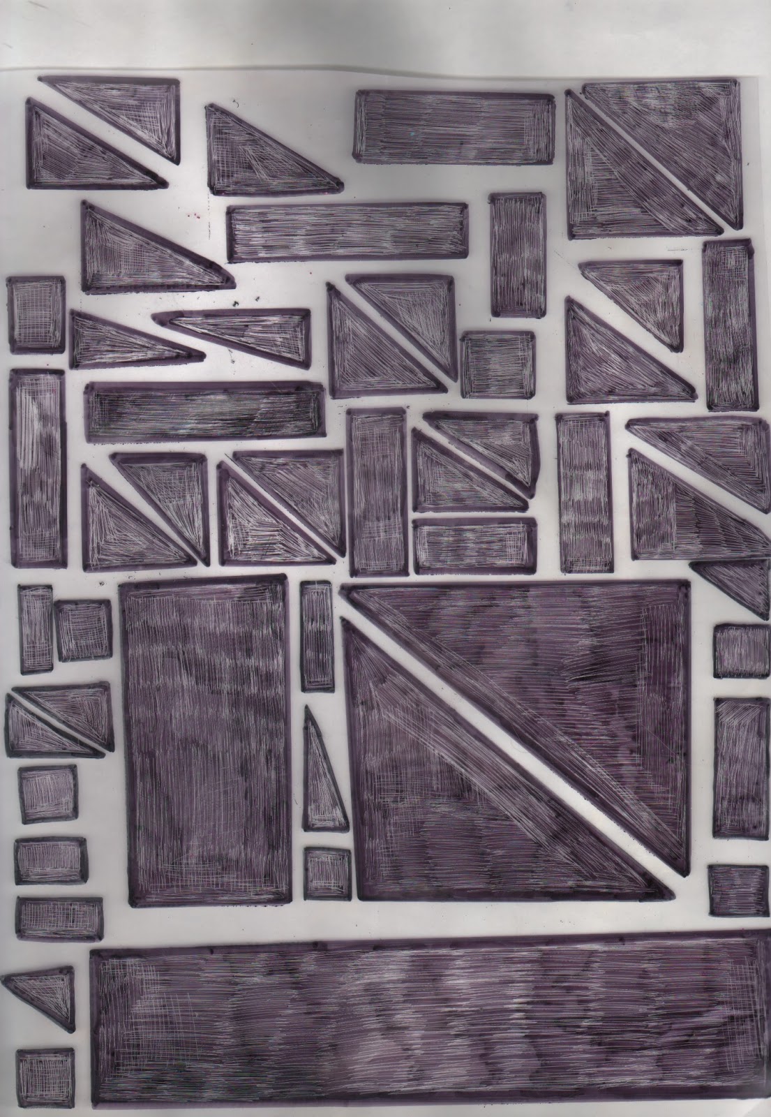
This the print design which I came up with from the original print design I had chosen, it is sketchy like I wanted to be and although on the computer it looks really fades once it has been printed on the fabric the effect is exactly what I wanted it too have looked like. This geometric shape goes really well with my art movement and I think I will be able to make it suit my target market.

I decided to play around with the scale of my print and have some larger shapes and smaller ones. I think this makes my print design more interesting. I wouldn't want my print this large so I needed to play around on photoshop until it is the size I want it too be. I also need to scratch into this print until it is the desired sketchy look which I wanted to achieve.
This is an image of the print after have worked into it and scratched out the unwanted matte effect. I tried to keep a bold outline of the geometric shapes but also get this sketchy effect that I wanted. I am happy with the outcome and I now want to play around with the scale and see if I can create a nice repeat print as I think would look interesting on my final garment.
We learnt about repeat print on paper and played around with the different ways of displaying the print and laying it out. I chose to have mine like this as I think it looked the best out of all of the repeat print designs. My print is quite repetitive so I this simple repetition looked really effective. I firstly trialled this on paper and then played around with the rotation on photoshop to see the outcomes here is my final print design.

I am really happy with my final print design. I am glad that I chose this style of repeating it as I think it has made more of a definition of the rectangles which before just blended it with the other geometric shapes. I think this will look really effective on my final garment.
No comments:
Post a Comment