Saturday 10 August 2013

Through the First Year.. with another shortly to begin!

I have finished my first year of the Extended Diploma in Fashion and Textiles at Plymouth College of Art which I thoroughly enjoyed through these short but very busy 12 months. I have learnt so much and developed so many different skills. It's been really rewarding watching my skills grow and develop. This time 12 months ago I didn't know anything about a sewing machine, pattern cutting or any of the equipment I now use on a daily bases without even thinking twice. I find myself looking at clothing and analyzing the way it has been manufactured and created; how the garment is finished, and what techniques they have used. 

I recently received my grades from the first year which I am completely over the moon with. At the beginning of the year my grades were average. I was achieving a Pass level which I really wasn't happy with. I pushed and pushed myself, asking for feedback, what I could do to make my grades higher, how I could achieve better until this started to come more routine and natural to me. I am so happy I did push myself because my grades really do show that my hard work has paid off. I achieved 5 Distinctions, 2 Merits and 1 Pass. I've never got such high grades in my life. I am over the moon with joy. Admittedly I am not happy with my Pass but I honestly didn't even think I would pass that unit. I have dropped pattern cutting in the next year as I'm taking promotion instead but I have decided that I would like to do an evening class in Pattern Cutting to keep learning more skills and allow myself to continue learning how to Pattern cut as I think it's a very important skill to have. 

I am really looking forward to the second year and I cannot wait to push myself even harder and achieve even more. I am just nervous about universities and choosing the right one for me. One more year and I'm leaving little Plymouth to go to university and start my career. I will make it! 

Monday 3 June 2013

Life Drawing - artist reseach

I have recently been attending life drawing classes to help me strengthen and develop my drawing skills. I have learnt many techniques since attending these classes which have really made my drawings much more professional and less cartoon and child-like. I can really see the development within my work which really show that taking these classes have really benefited me and my work. I can say that I now look at drawing from another perspective than I did before. I believe this will in the future will benefit my fashion illustrations drawings.


For part of this unit, I have looked at three different artists work to help develop my work and inspire me. The three artists I looked at are Caron Clarke, Stewart Clough and Malcolm Cudmore. Below are my views on their work and the inspiration I have taken from their work to develop my own work.


Caron Clarke


I firstly looked at Caron Clarke, as I found her artwork really inspiring. I liked the media she has used within her pieces as I thought it worked really well and added a lot of depth with the tones she uses. This image above really inspired me as I liked the fact she has used lots of different colours within the image. I like washed-out effect she has given in the background within the image which is something that I would like to achieve within my own work. It looks as if she has used ink or watercolour combined with water for this piece which is really effective. I like the way she has added tone in the image with the light and dark colours she has used. The abstract colours which she has used within this image is really interesting, this is something I would like to experiment with.


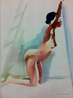
This is another image which interested me from her gallery. I like the fact once again she has displayed this washed-out effect in the background once again used what looks like a watercolour medium. This image interested me as she has added tone and depth with the light reflecting from the body and the depth of the shadows in the body. This is something I think I could try concentrating on within my own work. Within the background of the image, she has added an interesting detail which looks like it could be a ladder, I like the way this is muted to the rest of the image.


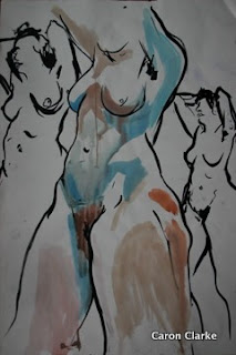
This image is what attracted me to her work as there is alot of movement within the position of the piece. This also reminded me of the previous artist I looked at within my book research named Bill Buchman; her style within the image is really similar to his but as I looked further into her work I realised her style was really different to his. They both seem to have used the same media but achieve really different outcomes. I like this specific image has it has a really strong outline with the washed-out watercolour effect. I like the way she has played around with composition also as I think this makes the image. I think this is something I could be trying out within my own work.

 
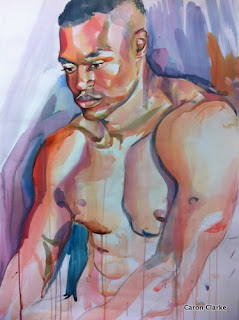
This final image really interested me as it is more of a portrait style with a really interesting composition. I like the fact she has expressive brush strokes in the background as adds more depth into the image. The tone has display within this portrait is exceptional as you can really tell were the light has hit the models body. This has inspired me to concentrate in this aspect within my own work as i believe before I hadn't put any thought into this before as it hadn't even crossed my mind what effect this could achieve.

I really Caron Clarkes work and it has really inspired me as I have realised what things I have been missing in my previous life drawing classes work. I think looking at her work will really help me develop my own work as I have opened my eyes to how much tone can really effect the image achieving a better overall look. I am also inspired to used ink and watercolour more within my images.

Stewart Clough
 
 
I looked into Stewart Clough's work has I was interested in his collage work which had a lot colour within it. Since researching into his work, I found that he did a lot different styles of art work which I could look at to develop a greater understanding of the artists style himself. I was mainly interested and inspired by how he combines collage within his work as I think this looks really effective and makes his work much more interesting.
 
 
I like the range of media he has used within the image as I think they all compliment one another. I have noticed that he has not only used collage which has inspired me within my own work but he has also used charcoal which is something I was interested in using myself. I like the way he has produced two of the image positioned in the same way is really effect and looks really interesting. The fact that both of these images are shaded in different ways and tones is also really interesting and looks very effective. I will try using charcoal and collage in my own work.
 
 
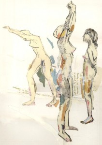
This image is similar to the image above. I liked this piece as it is very neutral and simple in colour which is something which really drew me to the picture. I like the way the artist has also combined this with the collaging technique which creates a really nice effect and adds more depth and interest in the image. I like the way he has used newspaper in this image to collage and this is something which I would like combine within my own life drawing work. The way the artist has position 3 different poses within one image is something that I would like to do in my own work as I believe this adds more depth into the work and makes it a lot more interest for the final piece.
 
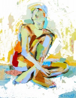
I looked into the artists work where he has used more colour as well as more collage. I like this images as it is really abstract and interesting. I like the way that the artist has used clashing colours as I think these really thrive off of each other complimenting the overall image. The background has very fascinating brush strokes which I believe make the image have a more messy and rough effective which is something that I believe would work well within my own personal style - this is something that I would try to achieve within my own work.
 
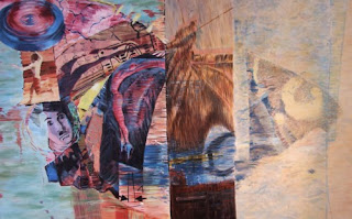
The image above is another style of work which the artist likes to work within. It is built up by collage. I like the way that he has created 4 different sections also as I believe this makes the piece much more pleasurable to the eye. This adds depth to the image with the tones he has used to create the marks which he has done. I looked into this style he uses as I wanted to see what range the artist has and I shows that he doesn't stick to one style. I will definitely be taking inspiration from this artists work.
 
Malcolm Cudmore


I looked into Cudmore's work as I liked the fact he uses rough and expressive mark making within his work. The fact that he uses grey backgrounds of Canson pastel paper really interested me as it is more refreshing to see than the usual white canva style background. The way he leaves some of his images unfinished also intrigued me as I like this affect. Cudmore's work is really expressive which is something that really engrossed me into his style although I am not really interested in the real life style and much prefer the colourful styles of the artists before as they are more like my own style of working.
 
Cudmore usually takes around 10-55 minutes to create most of his pieces which I think is around the same time I have to create my own work as I have a maximum of 30 minutes each pose. I also was interested by the fact that his uses charcoal and chalk within is work as these are mediums which I am interested to work in myself.


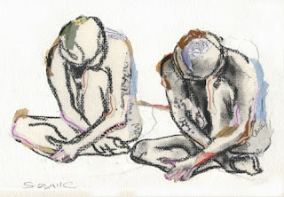
The main thing which interested me within Cudmore's work was his interesting brush strokes which is has achieved as I think this really makes the artwork as you can really see his expressive movement. I like the way he has used mainly black and white which is something that I personally like working in although I am not a massive fan of the realistic style within his work as I prefer the more expressive and abstract styles of working. I like the way he has defined the muscles within this image above as this looks really affect.
 
 
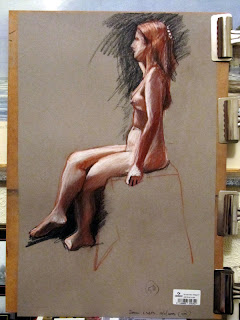
In this image above you can really see where the light has been caught on the models body as the artist has really focused on reflecting this. I like the way Cudmore has a distinctive outline around the silhouettes of the model, this works well with the light effect. The sketchy expressive background around her torso and feet is really interesting as this looks unfinished but works really well. This is something I would like to play around with and see if it works within my own personal style. The way he is left the stool as a faded outline is really nice and I can relate to this as this is something I have been doing previously within my work. I thought it looked rushed and messy but since looking at Cudmore's work I have changed my views and I believe this could work now.


Wednesday 24 April 2013

Sub Cultures - Mods


Mod is short for modernism and is a subculture that originated in London in the late 1950s and continued into the early to mid 1960s. It was developed and created by working class teenagers who were interested in the Italianate style as well as being art students who were part of the beatnik coffee bar culture. Mods were interested in fashion, music and motor scooters. 

When looking back at when the Mod sub-culture was developed it is essential to look at the social and economic climate at the time. The second world war left Britain in financial debt with Britain having to lend vast amounts of money from the USA as they had entered the world late and it didn't really effect their finances. Money was scarce in Britain during the 50's and compared to the American's wealth, the youth seemed to be enjoying Rock n Roll music, driving large Cadillac cars, it is easy to see why the British youth longed for happier times.


During the late 50's Britain's youth longed for their own identity, to be different and change their post-war image, and shake up the world a little by being heard. The rocker's wear all in leather motorbike gear with their Teddy Boy inspired greased back hair came revivals with the Mods who took a far greater care in their appearance. To be a Mod depended on your views, what you stood for, how you dressed and what music you listened to. The colour of your skin didn't matter as long as you were a Mod which allowed them to disregard the old racial stigma which is was really 'modern' concept compared to how previous generations had thought. 

Many of the early Mods were Jewish youths whose parents had settled in London after the war. These Jewish immigrants were renown for their excellent tayloring skills and they took great care in their appearance and that of their families. Jewish youth therefore wore tailored suits made from fine fabrics such as mohair. This stylish well present look was completely opposite to the Rockers style and was quickly adopted by the mod scene. 


During early 60's Britain the Mod youth movement began to gain momentum and exploded 1963/64. The famous film Quadrophenia was produced in 1979 by the Who. The film helped inspired thousands of more youth to the Mod culture movement and gave the movement international recognition. Even today the Mod movement remains strong in USA, Germany, Japan and of course still the UK. It is a youth subculture which has no intention of dying out and its very popular among fashion conscience youth today. 


Style:

Mod's tend to wear fishtail parka's to protect expensive Italian mohair tonik suits. Navy pea coats and Monkey jackets were some of the items of clothing also worn by mods.

The key to Mod clothing was being individual and wearing unique item of clothing that noone else would be seen wearing. The boutiques along Carnaby Street were excellent for this as they only had one or two pieces which were not created in mass production. Cult sixties bands such as the Rolling Stones, The Who and The Small Faces were seen buying their clothing buying mod clothing from boutiques on Carnaby Street.  


Mods used to get their clothing to have their clothes altered and tailored on a regular basis as well as adding something here or changing something to alter the appearance. This was all about being a mod and wanting to stand out of the 'norm'. 


Modern Mod Clothing

There are many British clothing institutions that have adopted Mod fashion within their clothing ranges. Brands such as Ben Sherman, Original Penguin, Lambretta and Fred Perry are included. Even Liam Gallagher member of the band oasis has a clothing range called Pretty Green which are known for producing mod style clothing.

Mod Music:

Mod's listened to music such as The Who, The Kinks, The Action, The Troggs, and The Animals. These are still bands which are regularly played today and are still easily recognised. 

Tuesday 23 April 2013

Final Evaluation of the Digital Sketchbook Project

I have found learning about the different types of digital software really interesting as I think it is definitely a good skill to have.  I think that being able to use Photoshop especially is quite important as it is used through-out loads of different artistic styles and jobs. I found using these programmes quite difficult as I think it takes a lot of practice and playing around to really get used to using the programmes.

 I have recently been using Photoshop to create fashion illustrations along side illustrator, I have created my final print on Photoshop and edited my final images for little black dress as well. Although I have done this I am not very able when it comes to using Photoshop and still have a lot of practising to do but my skills on the programme have definitely develop through each unit. 

Looking into fashion photographers and illustrators was fun as it was nice to see the differences that their artwork both had but the both used the same programmes for their final outcome.This just shows the completely different effects which can be achieved when using these programmes and it really opens your eyes to what you can do with these programmes.

I found looking into digital illustrators inspiring for my own digital fashion illustrations as this allowed me to see how they produced their work, the techniques that have used to create this imagery, and also more about the artist and their individual style. It was also interesting looking to fashion photographers although we don't have a photography unit this term so it was less inspiring but it was nice to see the way artists used the programmes to enhance images making them look more professional compared to those who don't.

I will definitely be using this programmes again in the future to create my own work, but I need to get more able when using the programme so I will have to practise a little more. I am glad we have learnt how to use these software's as I think it is a very good skill to have not only for my own personal use but also for if/when I get a job in industry as the ability to use Photoshop is a very useful and wanted skill. This would make me stand out more over more candidates.


Monday 22 April 2013

Fashion Illustrations

I decided to create a fashion illustration using Adobe Photoshop and Illustrator to put my new learnt skills to the test. I created one model but played around with her appearance to created two images of fashion illustration. Here is how I did it.

I firstly found a template on the internet which I liked and traced around it on Illustrator using the pen tool.


This is the process that I did on Adobe illustrator. The first image is the template which I traced around and the image below that is my template. This is the starting point for your fashion Illustrations and this is where you start to create your own design. As you can see from the top image and the one below have created a dress which has a split up the seam this is where I will be adding my own print design to reveal my dress design. 


I then transferred the image into Photoshop so then I could add my print into the dress. I found this print on Google but I intend to make more with my actual print on, as I hadn't designed my print at all when I created this fashion Illustration.


I selected areas with the magic wand tool to highlight certain sections which I wanted to have the dress print on. I also added the print design I had found into the patterns on photoshop selecting this and using the paint box tool to fill this section leaving the garment on the template  I repeated this for all the other sections such as the hair and skin. 

Here is the final print design. 

I experimented with my designs by having the same templete but I changed the hair colour and got rid of the outline. 


I am really happy with these fashion illustrations. I think it has really helped develop my Photoshop skills and opened my eyes to another way of design things. I am happy with my outcome as I like my design, I think it really simple and effected and by using these two programmes I have created a really smooth outcome which looks flawless. I am really happy with the outcome. Although it was a lot to learn as I went and really think it has helped me. 


Wednesday 17 April 2013

Mark Making and Colour Development

I decided to see what my print would look like on my garment by layering my print on top of my fabric samples. I did this by scanning in my print design as well as my fabric samples and the rest I completed on Photoshop. I did print on my flat print design as it made it easier to colour in each shape to see how the colours go together and what colours I could use for my final print. This was along side real trials down stairs in the print room. 


This is the first print I trialled with colour. I think I looks effective with little sections of colour but it isn't practical to do as I would need more than one silk screens to achieve this look as each colour would need another screen so than I could do them individually. I think this would look cool but I also doesn't work with my chosen dying effective. This is not practical and I won't be using it.


I decided to develop this idea though but using the larger print design to see what it would look like individual colours I think this look effective but I would need a plain coloured dyed fabric else I think it would be too busy. This doesn't work with the fabric colours I wanted to dye. I would also have the same problem with needing more than one silk screen. I don't have to make this design but I am glad I experimented. 


I decided to experiment with block colour print design and a busy background as this is what I am aiming for in my in my final print. I think I want it to be white, grey or black. I did this experiment to see how my designs would look like for my final print. This is my favourite print design but obviously my print its self has been developed further and it will still be different from this slightly but it is basically the same as it will be with the same ideas.


I think this design looks really effective even though it is in colour I think having only the larger shapes in colour actually looks quite interesting. The only problem is this would take long to do as I would need 2 screens or I would need to section it off and I don't enough time to do this so I think I would end up cutting corners and having less of a crisp finish. 


This print is really effective and is probably one of my favourite designs from this experimentation, I definitely prefer it too my chosen image, but I believe this is because I like the colours and it is really different. I didn't like is as much when I created it but looking back it is really effective. I would need 2 screens for this print which would restrict my time more and making it harder to stay on target as I have already over set myself work by having 3 times as much fabric as others. This isn't practical. 


I think this print works really well together the colours of both the print and background are really similar which compliments on another. I think this print looks really effective, it is really close to what i want for my final design but I want the background colours to be bright and more pink and  purple based. I do want the print to be light like this and this experimentation has inspired me for my own print. 


Mark making and print development


I had to embrace my art movement which is Bauhaus when creating my first mark making sheet. At this point I slightly different inspiration for my print design I was still interested in colour but I preferred more pastel colours. I also looked into the Bauhaus alphabet as I thought this could work really well on a print design. I was also inspired by war and the weapons used when at war as Bauhaus came around after WW1. This is why I chose to create a gun which was made out of lipsticks as this is a weapon but it has been made up out of more interesting materials and lipsticks are feminine which is something I knew I wanted to portray in my garment. I chose mac lipsticks mainly as I think they have a very interesting shape as well as resembling bullets. 

The block colours 'samples' on the page were inspired by the the use of colour within Bauhaus which is a key factor within this art movement. I thought about this more deeply and when thinking about paint I thought of the samples that you can get from Dulex which is what give me this idea. I also played around with blowing ink as I think this looks really effective and would look good on the a print design.

This was just my starting point and was mainly experimentation.  This helped me develop my final designs and get to where I am. 


I decided to develop my print further as I didn't think it fitted back to my art movement very well and I didn't get any further inspiration for my print design. I decided to focus on Geometric shapes as well as the running ink as I thought this would look pretty interesting on a garment. I trialled with 3 different types of print designs to see what they would come out like, these designs are on the left. 

The first design is on the left hand side of the top image. This is my running ink effect. Although I really liked the idea of this I didn't like the effect it achieved once dry and I thought that doing this through the screen printing technique wouldn't look how I wanted it too so I have decided to ditch this idea. 


The second print design on the right of this picture is my favourite print design out of all of them is the starting point for what I used as my final print. I wanted to embrace Bauhaus' use of geometric shapes as I thought this would look really effective as a print design. I really like this print design but the only thing I would change is I would develop it further by playing around with scale and making it more sketchy when it is printed. To do this i must leave some white areas on the see through paper. I like the way it is slightly repetitive. 


The third print design I wasn't too sure of as I think my second one was stronger. I tried to add circles into this print as I had them in no other print, as well as adding lines. I don't like the effect that the lines have achieved and if I were to use this for my final garment I definitely would  have used a ruler to make them with. I think it definitely shows strong influences from my art movement unlike the first print design. 


I want to develop the second design for my final print design as I think this one is my strongest print design. I will develop this print by making it more scratchy by leaving more white on the coditrace as well as playing around with the scale of the shapes as I think this could look really effective for my final print design. 


PRINT DEVELOPMENT AND MARK MAKING USING PHOTOSHOP


This the print design which I came up with from the original print design I had chosen, it is sketchy like I wanted to be and although on the computer it looks really fades once it has been printed on the fabric the effect is exactly what I wanted it too have looked like. This geometric shape goes really well with my art movement and I think I will be able to make it suit my target market. 


I decided to play around with the scale of my print and have some larger shapes and smaller ones. I think this makes my print design more interesting. I wouldn't want my print this large so I needed to play around on photoshop until it is the size I want it too be. I also need to scratch into this print until it is the desired sketchy look which I wanted to achieve. 


This is an image of the print after have worked into it and scratched out the unwanted matte effect. I tried to keep a bold outline of the geometric shapes but also get this sketchy effect that I wanted. I am happy with the outcome and I now want to play around with the scale and see if I can create a nice repeat print as I think would look interesting on my final garment.

We learnt about repeat print on paper and played around with the different ways of displaying the print and laying it out. I chose to have mine like this as I think it looked the best out of all of the repeat print designs. My print is quite repetitive so I this simple repetition looked really effective. I firstly trialled this on paper and then played around with the rotation on photoshop to see the outcomes here is my final print design. 


I am really happy with my final print design. I am glad that I chose this style of repeating it as I think it has made more of a definition of the rectangles which before just blended it with the other geometric shapes. I think this will look really effective on my final garment.